
Reframe Digital branding
Creative without constraint
SERVICES
Brand strategy / Naming and strapline / Visual identity / Art direction / Animation / Website
Reframe Digital is a London-based digital agency that delivers bespoke solutions for clients in real estate, marketing, and entertainment. Their approach is defined by flexibility and creativity, offering clients the tools to escape technical limitations and focus on the bigger picture. Reframe Digital positions itself as the partner that thrives on solving creative challenges with tailored, innovative solutions.
Our work included defining a core philosophy and ethos through a brand strategy, crafting a distinctive name that reflects their approach and a strapline that articulates their value proposition, brought to life with a comprehensive visual identity. To showcase the brand we designed a minimalist website that embodies their bold brand.
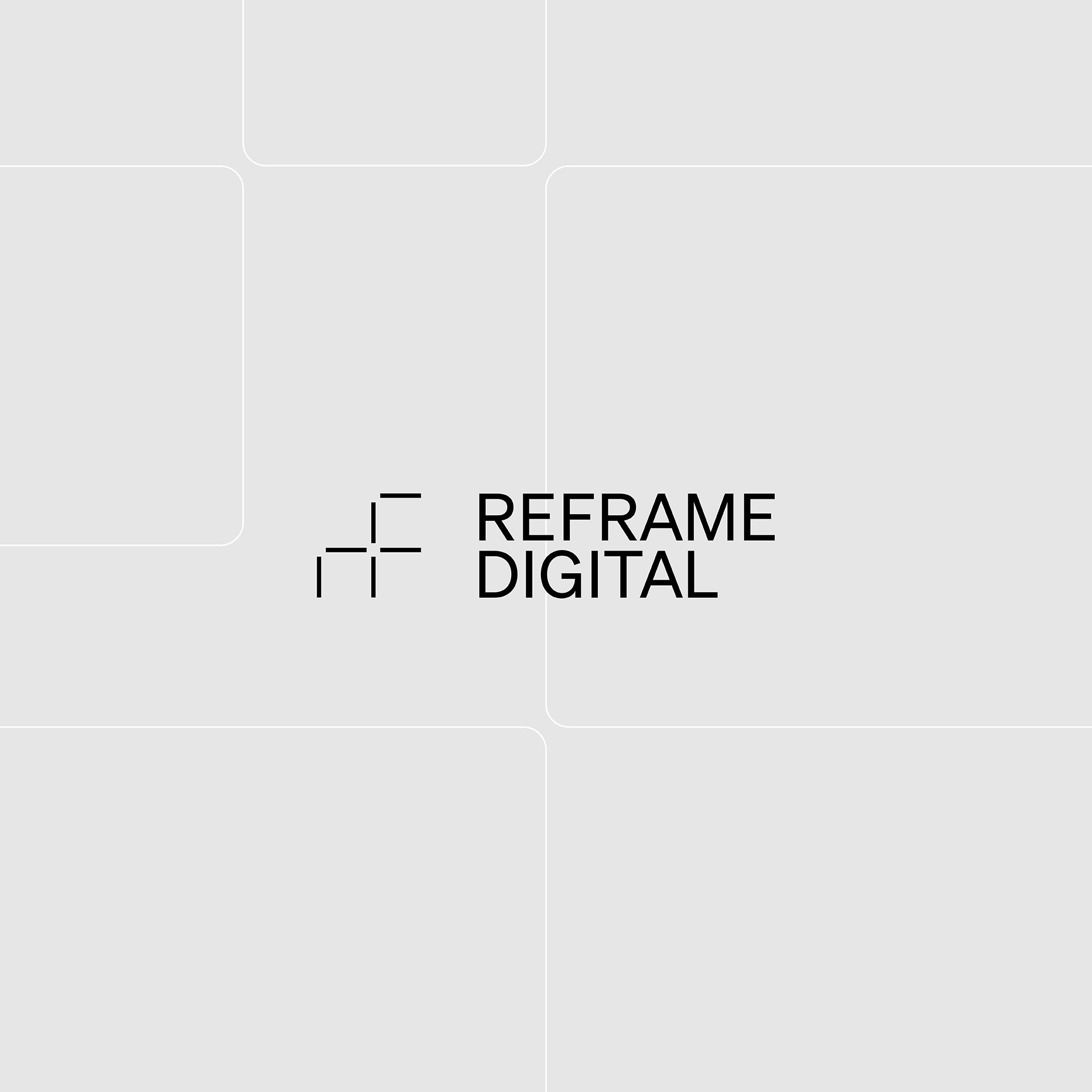
Frame mark logo and RF monogram for Reframe Digital – JMCO
Central principle of Freedom
-
At the heart of our efforts was the central principle of ‘Freedom’, shaping every element of the brand. This principle highlights how Reframe Digital liberates clients from technical constraints, providing the freedom to concentrate on their broader creative vision.
Reframe Digital brand strategy – JMCO
A unique name that expresses their approach
-
The name Reframe Digital stands out in a crowded market by emphasising the agency’s ability to rethink, reimagine, and redefine solutions. It reflects their focus on tailoring creative responses to each client’s unique challenges, unbound by rigid formats or conventions.
Reframe Digital strapline animation – JMCO
A logo constructed from agile frame marks
-
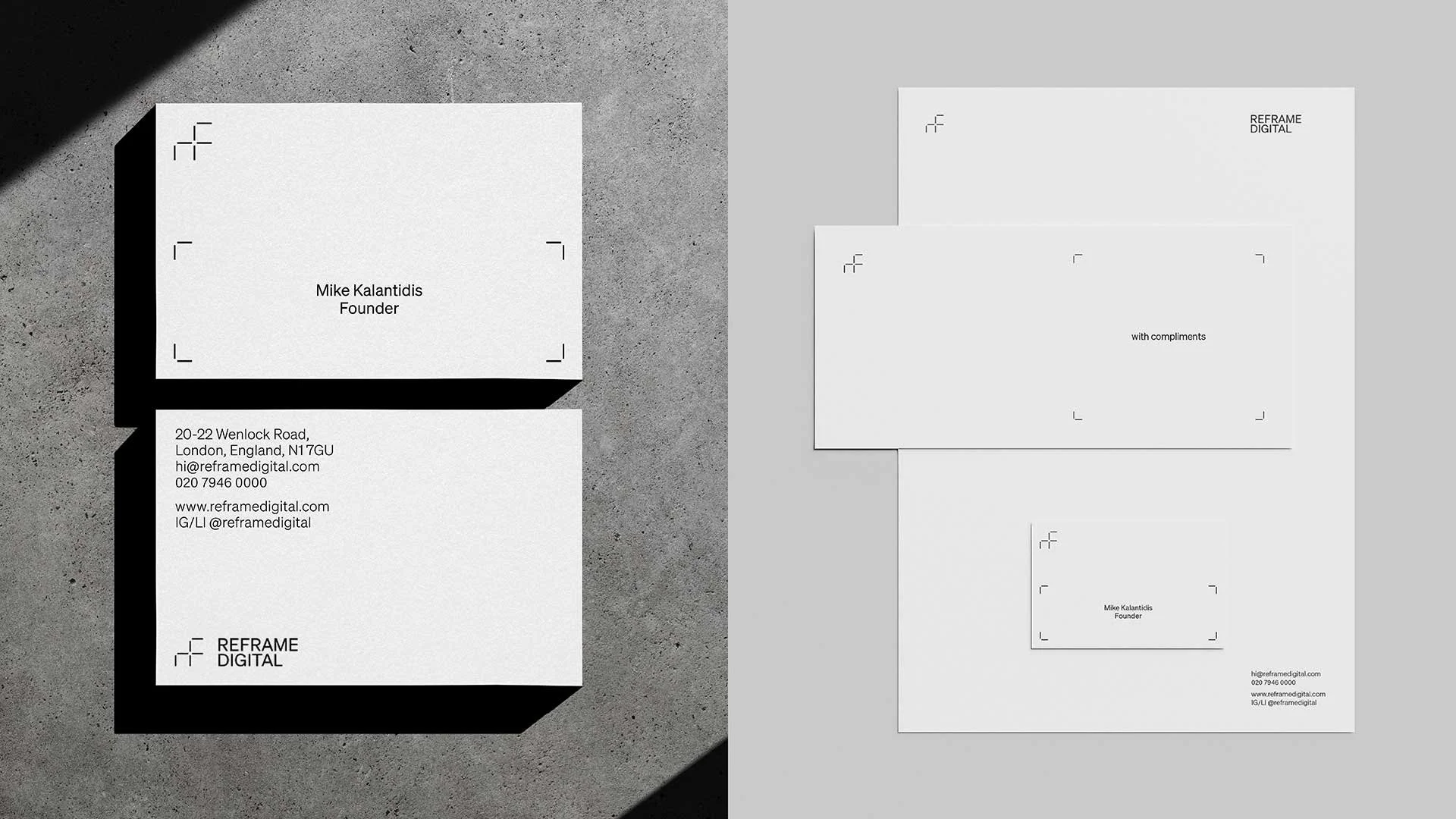
The logo is a visual representation of the agency’s adaptability and creativity. Constructed from frame or crop marks, it cleverly combines to form an RF monogram, a subtle nod to the brand name. In motion, the frame marks animate fluidly, symbolising Reframe’s ability to adapt and flex to meet specific client requirements.
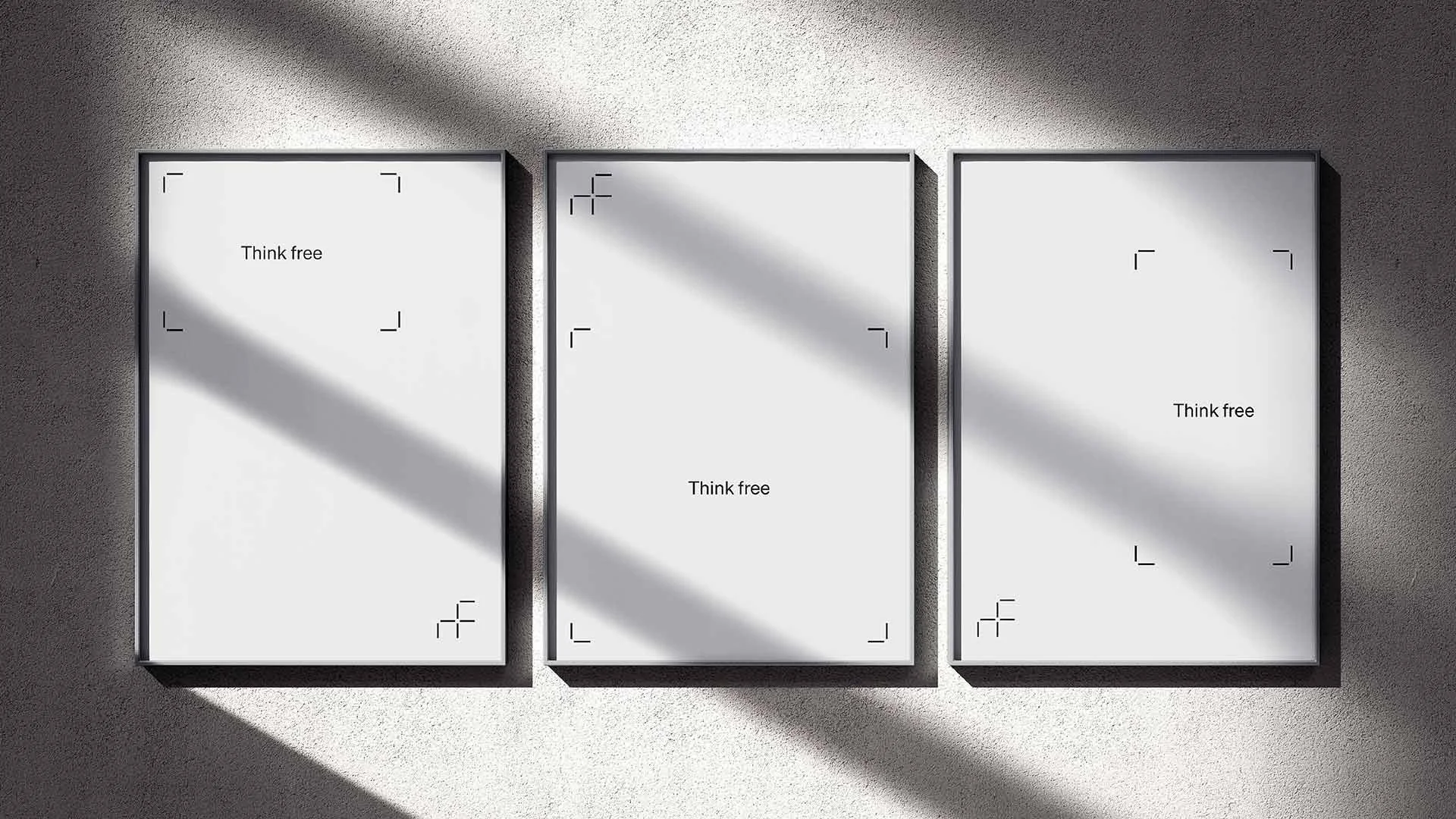
A strapline that champions Freedom
-
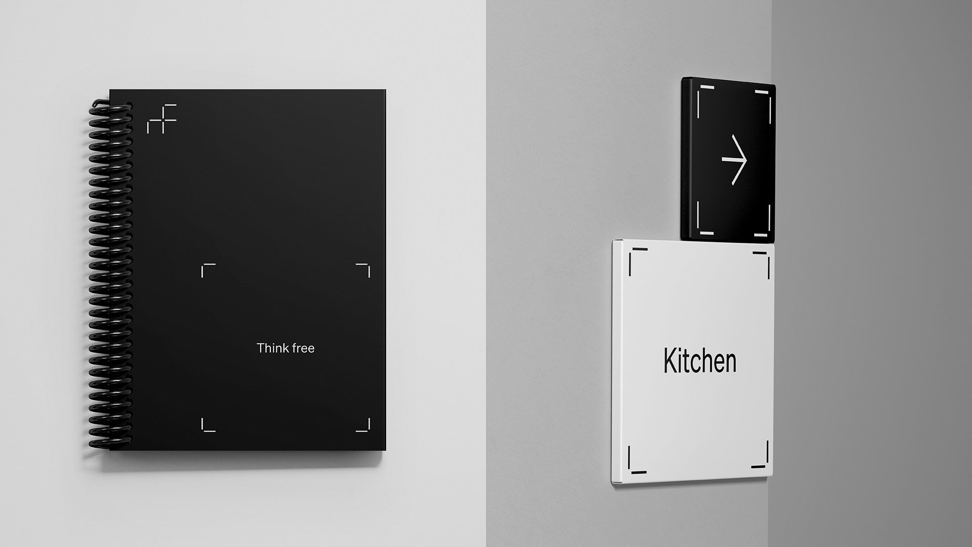
The strapline, “Think free” champions the agency’s core offering - empowering clients to focus on the big picture while their digital needs are expertly managed.
“Very perceptive and good listeners. We dived deep into the core of what the brand should be, combined it with past experiences and explored fully.”
FOUNDER, REFRAME DIGITAL
Reframe Digital website desktop animations – JMCO
A versatile graphic system
-
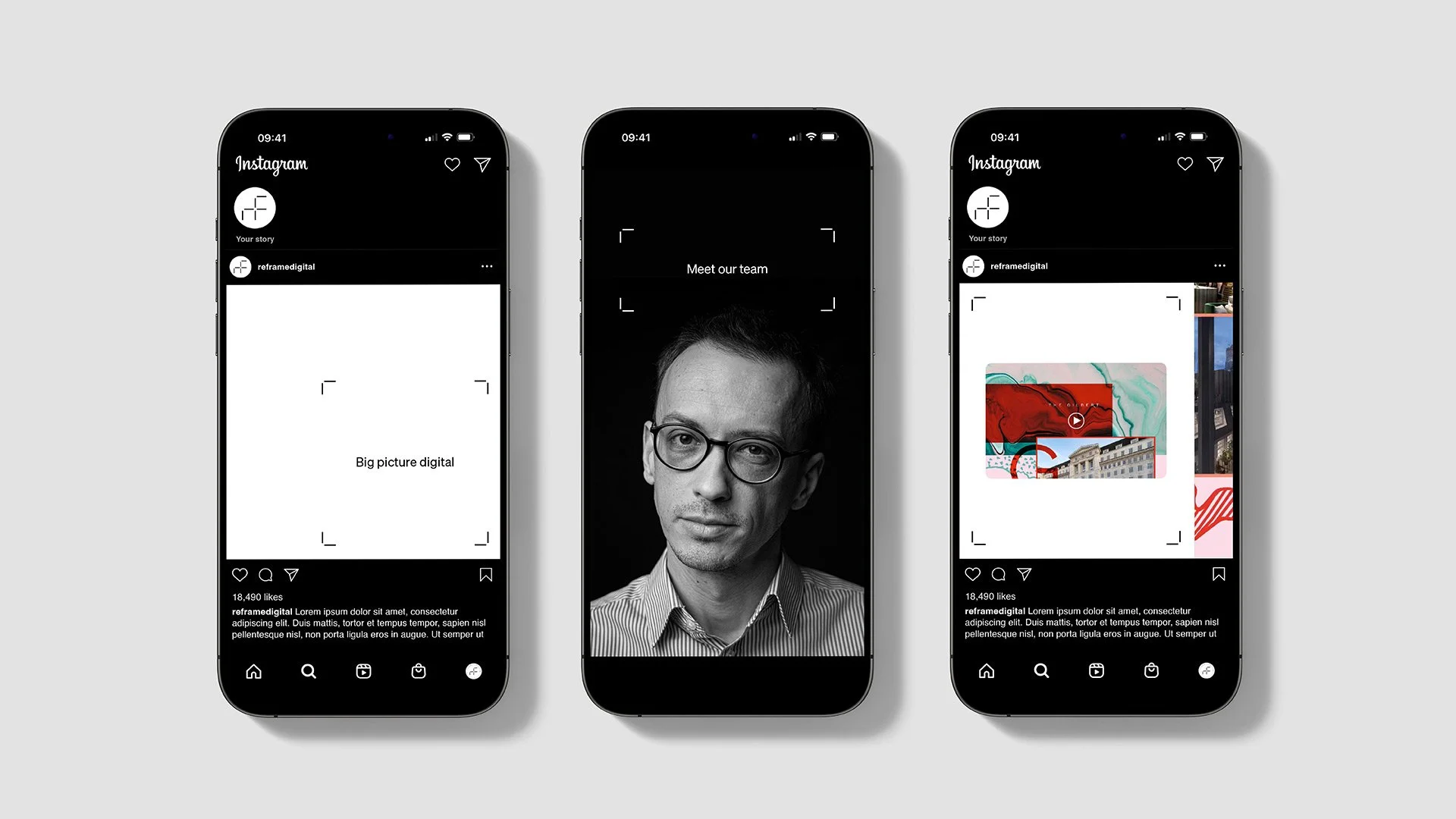
The frame marks extend beyond the logo to create a versatile graphic system, used to highlight content and structure dynamic compositions. This system reinforces the brand’s identity as flexible, modern, and solutions-driven.
Reframe Digital website mobile animations – JMCO
Minimalist colour palette and typography that heroes the content
-
The stripped-back black and white palette reflects the agency’s ethos of starting with a blank canvas, offering endless possibilities to build custom solutions. This minimalist approach mirrors the elegance of a gallery identity, allowing Reframe’s creative work to take centre stage. The monochrome scheme also ensures a timeless and sophisticated aesthetic, enhancing the brand’s professionalism and approachability.
The typography is clean and contemporary, chosen to maintain clarity and align with the modern and minimalist visual language. Its simplicity complements the black-and-white palette, ensuring that the overall design remains sleek and impactful.
Reframe Digital website mobile animations – JMCO
A website that tells the brand story through form and function
-
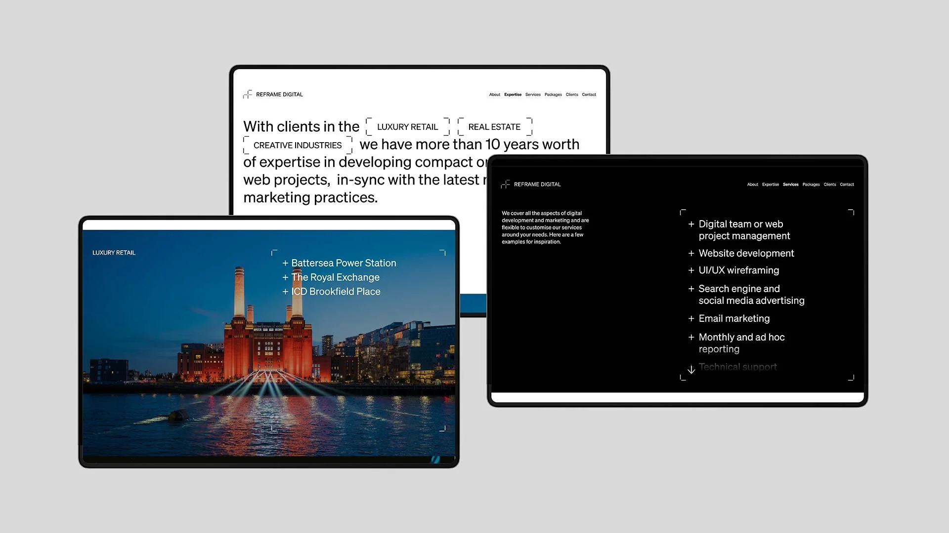
The website builds upon the branding, offering an intuitive and visually striking digital experience. It reflects Reframe’s dedication to combining form and function, showcasing their work while providing an effortless user journey.

Reframe Digital brand typography – JMCO
Reframe Digital brand colour palette – JMCO
The brand positions Reframe as a standout player in the competitive digital agency space and communicates their value proposition clearly: they are the partner that allows clients to escape limitations, focus on the bigger picture, and achieve their creative ambitions. Reframe Digital’s brand is a testament to their philosophy - bold, flexible, and boundless in possibility.
CREDITS
Strategy and copywriting: with David Sharp
Font: Söhne by Klim Type Foundry