
Sushea branding
Asian fusion cut with Cornish surf culture
SERVICES
Visual identity / Signage / Packaging / Menu
Sushea is a sushi and Asian fusion restaurant in Newquay, Cornwall.
JMCO supported Sushea with their visual identity and printed material including signage, packaging, menus and uniforms.

Inspired by Cornish surf culture
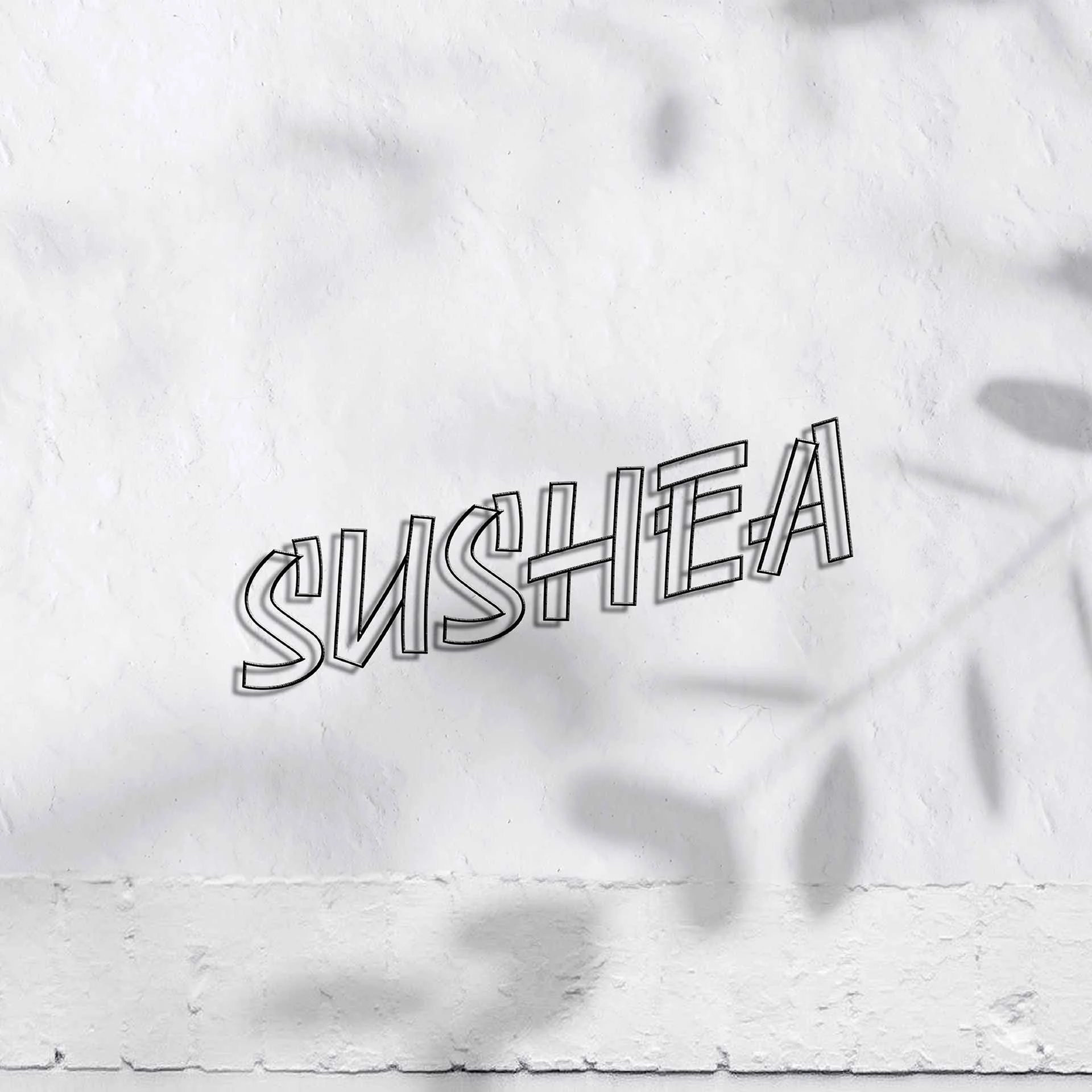
The identity centres around the bold, playful typographic system which has wood shack style with a confident attitude, capturing the essence of Cornish surf culture which makes Newquay unique.

A bespoke wordmark
The wordmark is bespoke, created with Gig from FutureFonts. The confident, characterful script reflects the energy of Japanese brush script with the attitude of Cornish surf culture, a perfect combination to match the vibe.


A playful symbol
The typographic approach is supported by a playful symbol that combines sushi and surfing. The wave forms a hand arching over like a breaking wave and holding the chop sticks.


The result, an identity that has standout on the high street and social channels, appeals to both locals and tourists by reflecting the character of the town and capturing the personality and dining experience of the business.
CREDITS
Font: Gig by Futurefonts, Moderat by Tightype