
Propulo branding
Revolutionising property
SERVICES
Brand strategy / Brand naming and identity
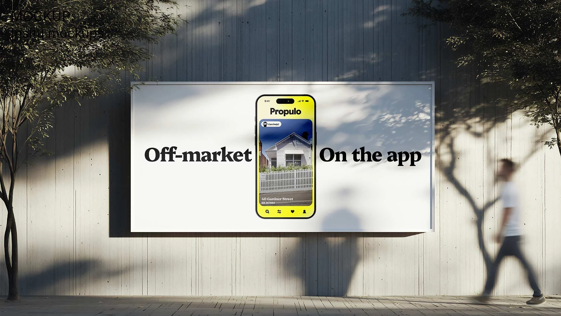
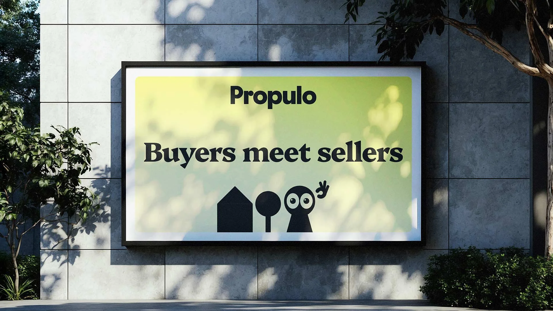
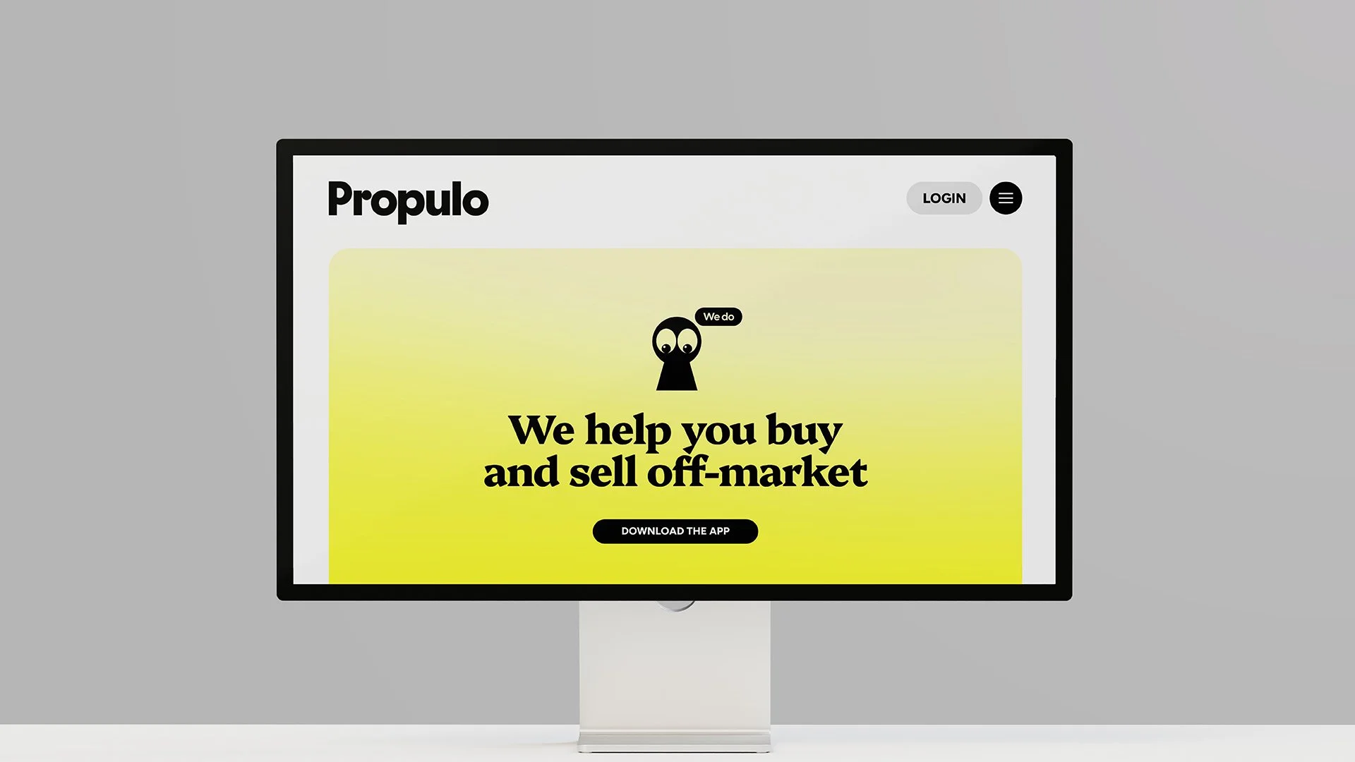
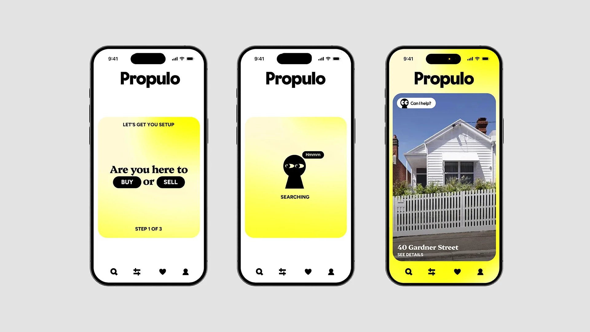
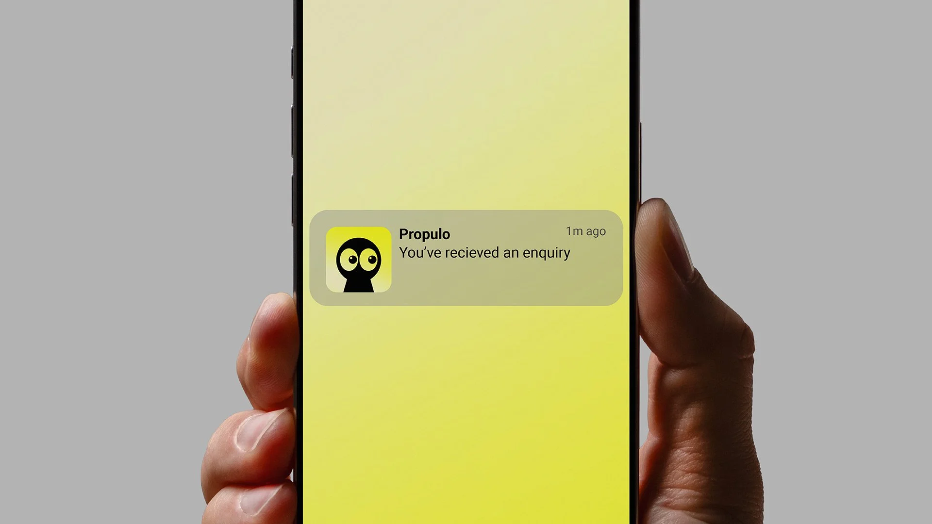
Australia's first AI-powered property matching platform. Buyers swipe on perfectly matched off-market properties and when both parties' expectations align, Propulo connect them directly. Think Tinder meets off-market real estate, powered by AI.
We established a strong, launch-ready brand identity that positions the business as a credible and distinctive alternative within the property market. The scope included strategic brand naming, logo design, colour palette, typography, concise brand guidelines, and a complete file package for implementation.
A brand centred around a helpful assistant
-
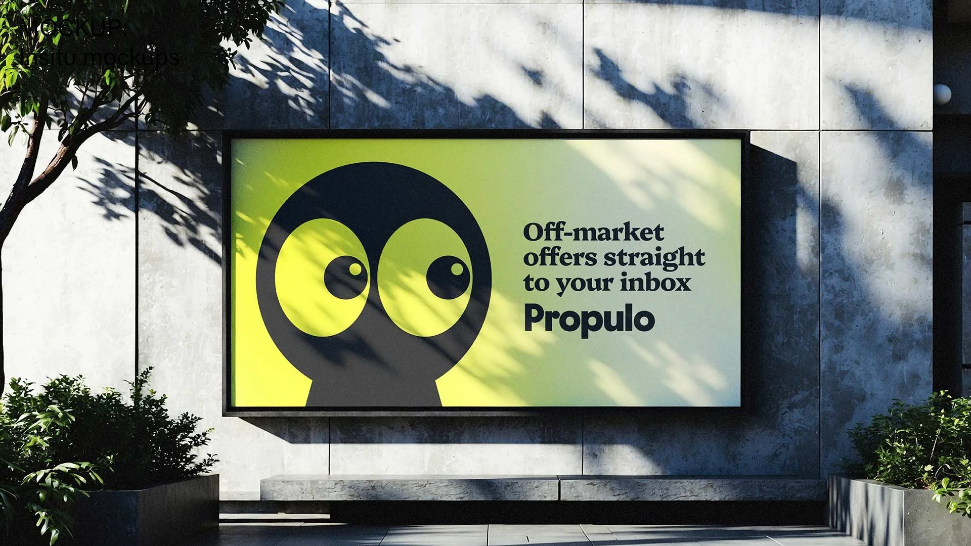
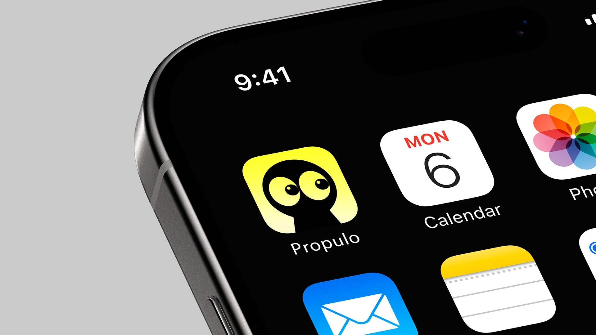
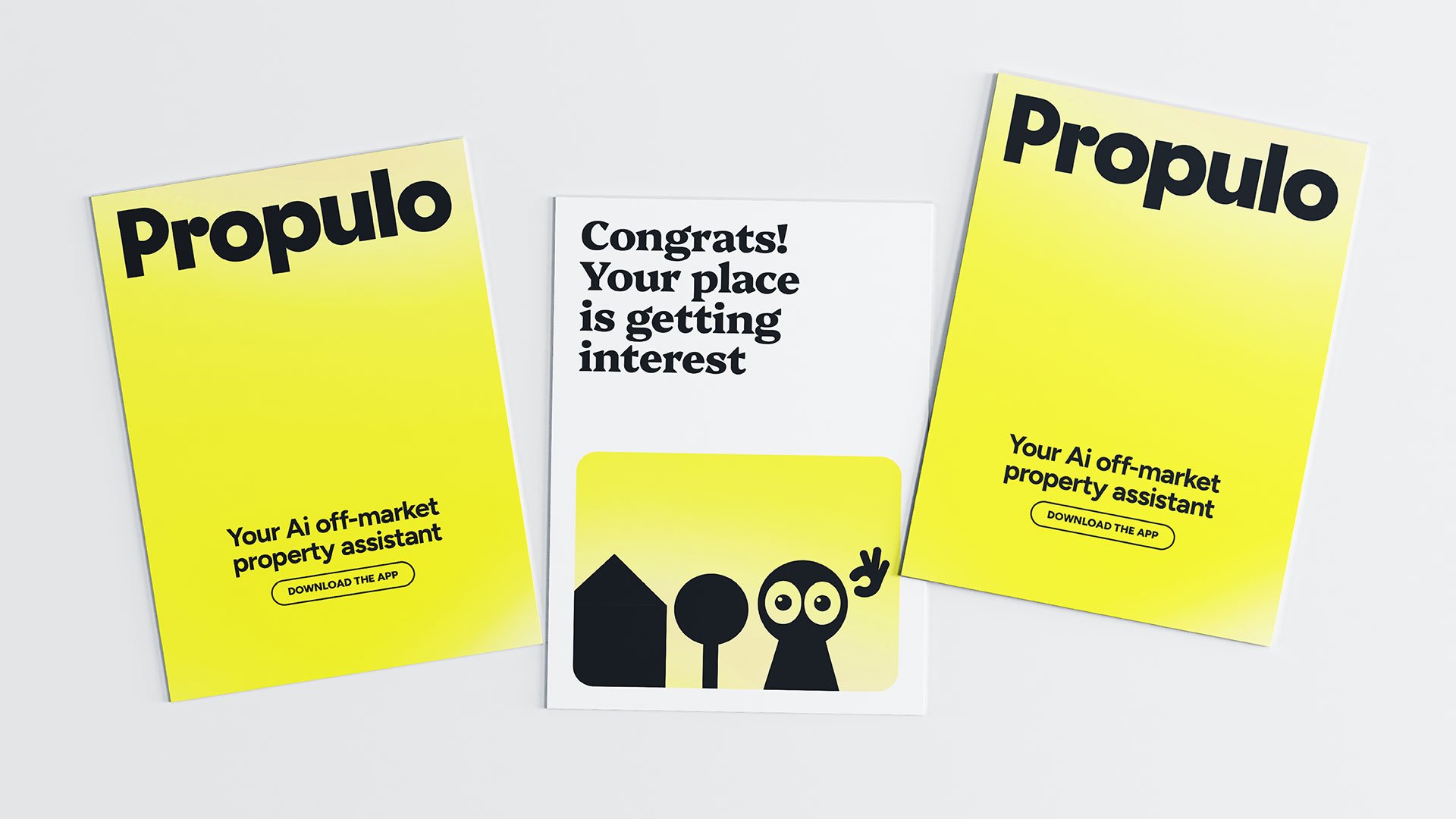
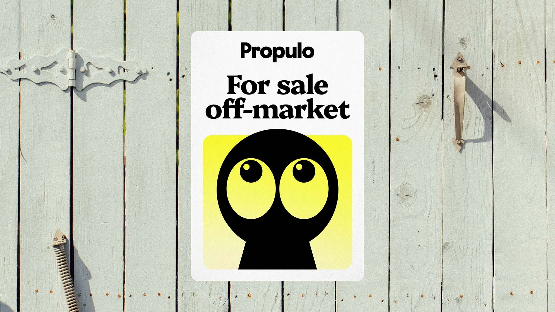
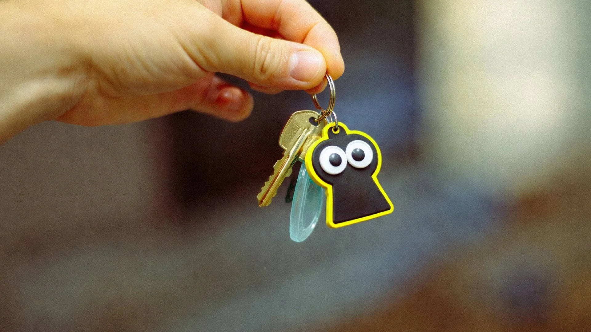
The brand is built around Lockey, a character-led mascot that brings personality, approachability, and trust to the residential property experience. Lockey represents the brand's AI-powered assistant, guiding users through the off-market property journey and making the process feel more human and supportive. Whether helping connect buyers with sellers or simplifying complex decisions, Lockey serves as a friendly, knowledgeable companion at every step.
A name that means 'property for the people'
-
The name Propulo reflects the brand's purpose: property for the people. Inspired by the Latin phrase pro populo, meaning "for the people". The result is a name that captures the brand's accessible, people-first ethos while conveying the energy, personality, and modern approach that sets Propulo apart within the real estate market.
A mark that communicates confidence and instills trust
-
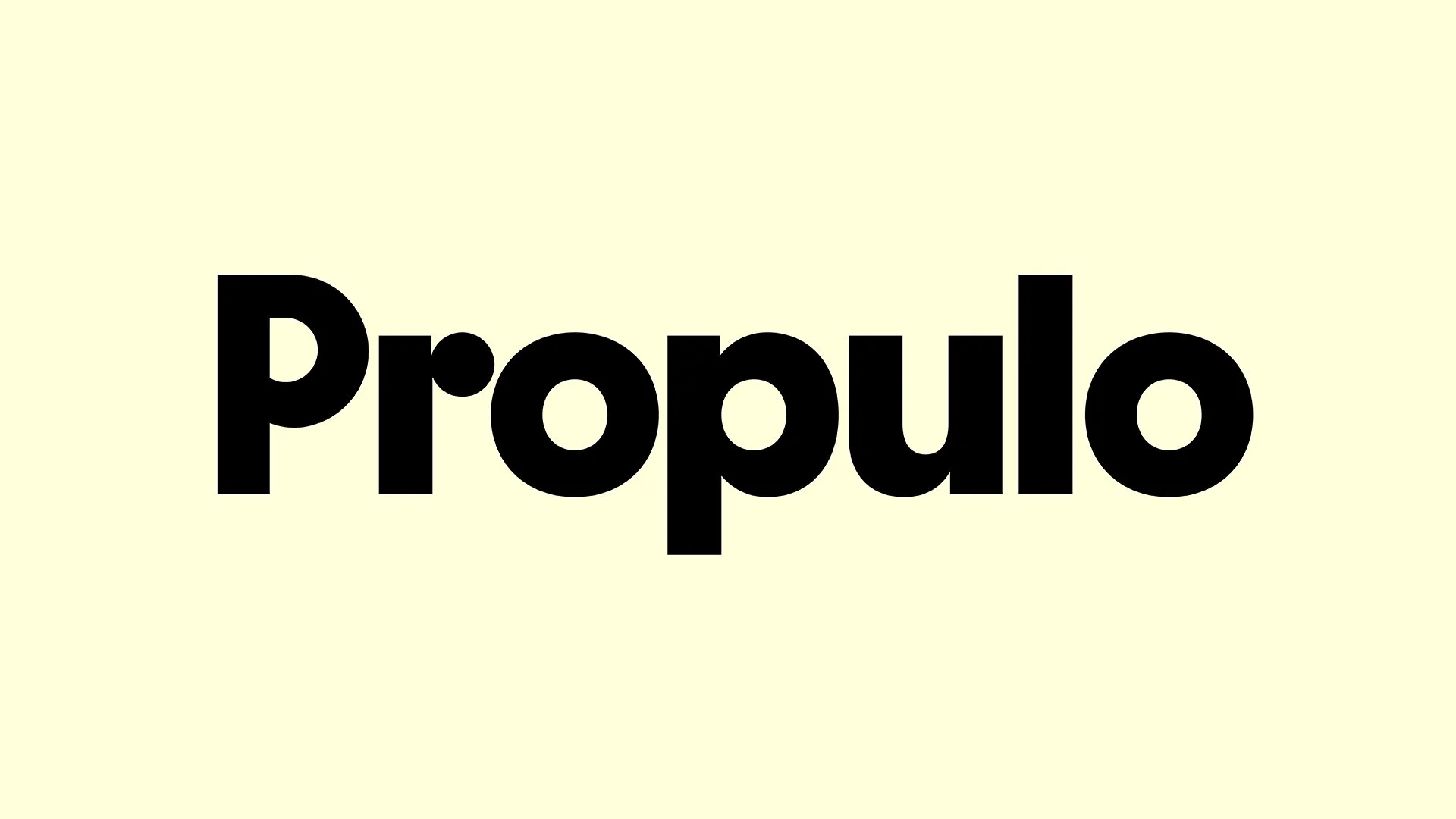
The Propulo wordmark is designed to convey confidence and trust through a clean, modern, and refined aesthetic. Inspired by the geometric forms of the Lockey mascot, it creates a cohesive identity that reflects the brand's technology-driven yet approachable personality.
A bold and unique colour palette for distinction and stand out
-
The colour palette is designed to feel bold and distinctive, carving out a unique visual territory within the Australian property space. A dynamic motion gradient reinforces the sense of a system that is always active and evolving, delivering real-time, up-to-date information. This approach moves away from static, traditional branding and instead reflects a modern, technology-led platform that is constantly working in the background.
Type that expresses personality
-
The typography pairs a bold, chunky serif with a clean sans serif to balance personality with clarity. The serif adds warmth and a human touch, echoing the rounded and angular graphic language of Lockey, while the sans serif provides simplicity, readability, and a modern feel across all digital touchpoints.
The identity differentiates the brand from established competitors, builds trust with customers, has the ability to scale across digital touchpoints, and provides a solid foundation that can evolve as the business grows.
CREDITS
Font: Platypi and Figtree from Google Fonts