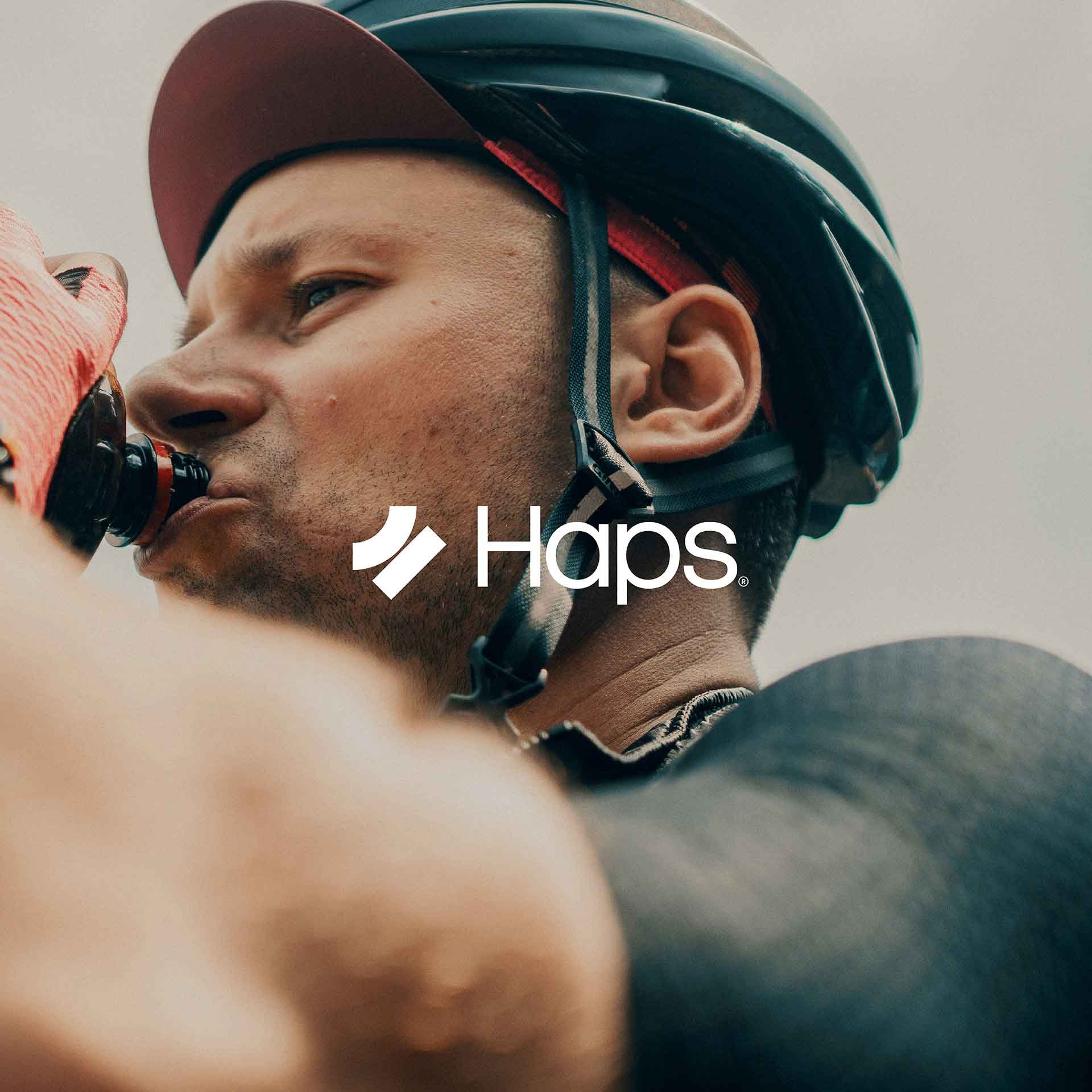
Haps branding
Raising helmet safety
SERVICES
Competitor research and interviews / Brand strategy / Naming and strapline / Visual identity / Tone of voice / Art direction / Illustration / Animation / Copywriting / Website design
The cycle helmet rating scheme was developed to empower consumers with reliable safety information while encouraging helmet manufacturers to raise their safety standards. This innovative concept aimed to establish a trusted hub for helmet safety, unifying existing safety standards and driving industry-wide improvements.
To bring this vision to life, our creative process involved thorough research, including stakeholder interviews and brand strategy workshops. These insights informed every aspect of the project, from naming and strapline development to visual identity, motion theory, tone of voice, and website design.
Haps logo and strapline animation – JMCO
Authority – building trust and leadership in helmet safety
-
The guiding principle for the branding was ‘Authority’ - a quality critical to building consumer trust and positioning the scheme as the most respected source of helmet safety information. Every element of the brand was crafted to embody this principle, ensuring the organisation could act as a credible and influential voice in its industry.
Haps brand strategy – JMCO
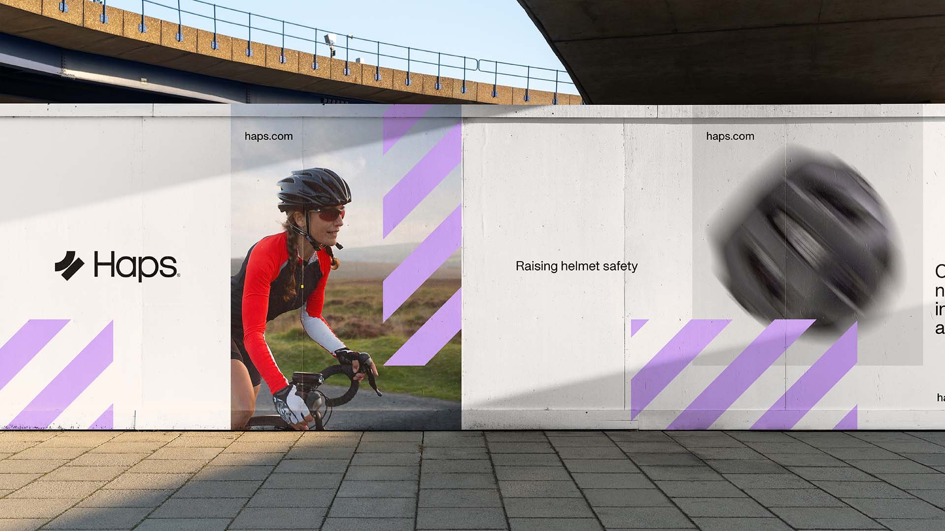


Haps brand photography – JMCO
Haps safety graphic animation – JMCO
Logo design inspired by 45° impact science
-
The logo is rooted in the science of the helmet safety, specifically the 45° impacts that define the scheme’s innovative safety protocol. This visually reinforces the brand’s authority on safety while serving as an eye-catching and distinctive graphic. The 45° angle is also echoed in the dominant safety graphic used throughout the brand’s materials, creating a cohesive and powerful visual identity that enhances immediate brand recognition.

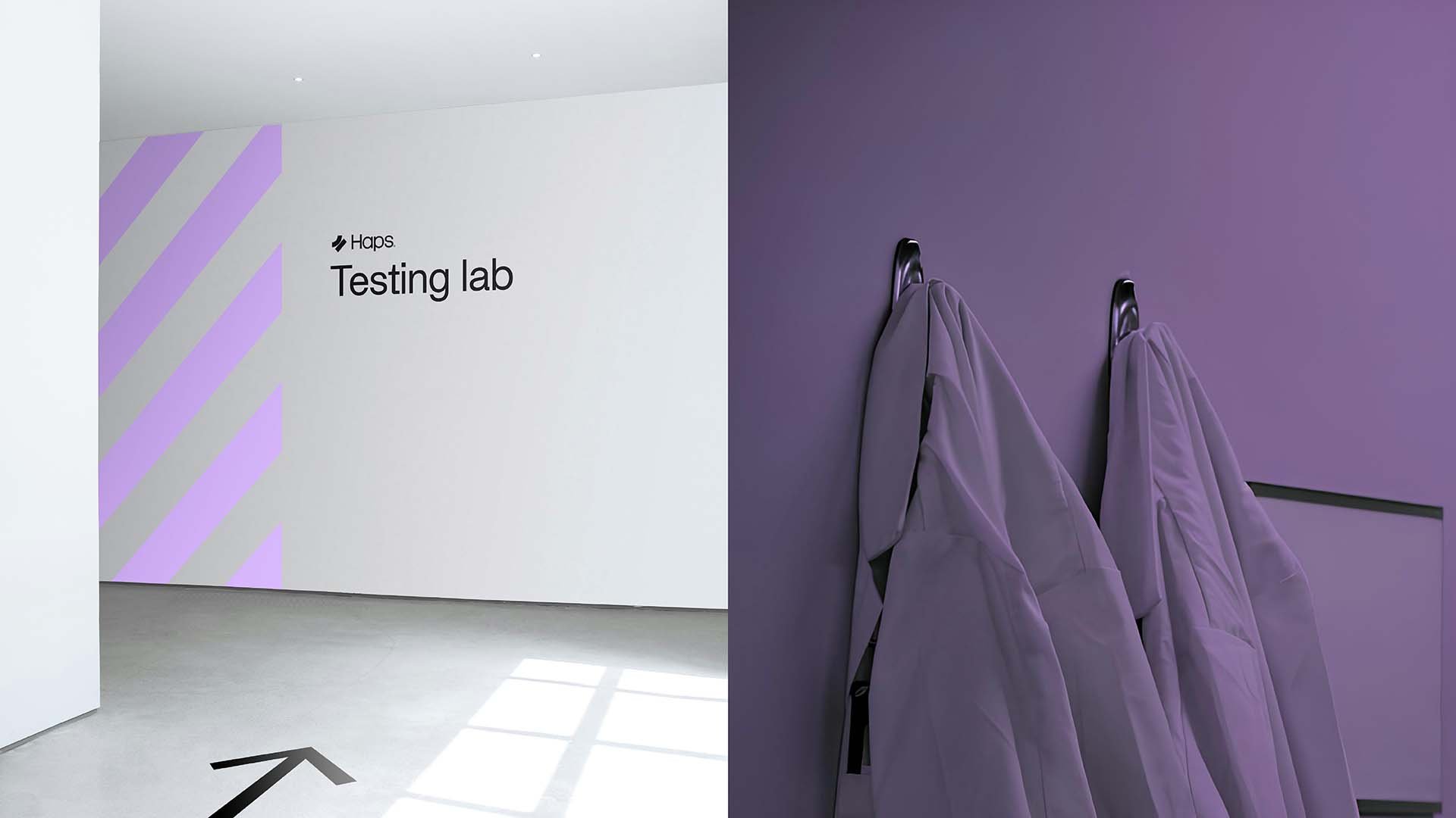
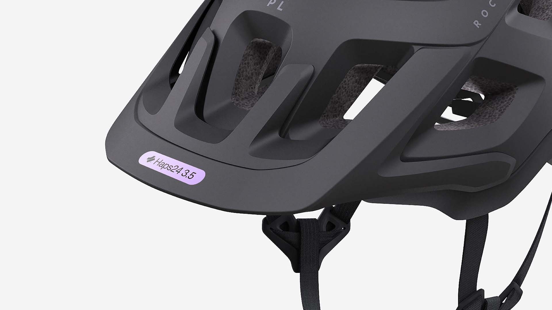

A distinctive, clinical colour palette
-
The brand’s primary colour, purple, is associated with healthcare and clinical expertise. It evokes trust, professionalism, and a sense of care - key qualities for a safety-focused organisation. This distinctive colour also helps the brand stand apart in a marketplace often dominated by bolder, sportier tones, creating a unique and memorable identity that resonates with both consumers and industry stakeholders.

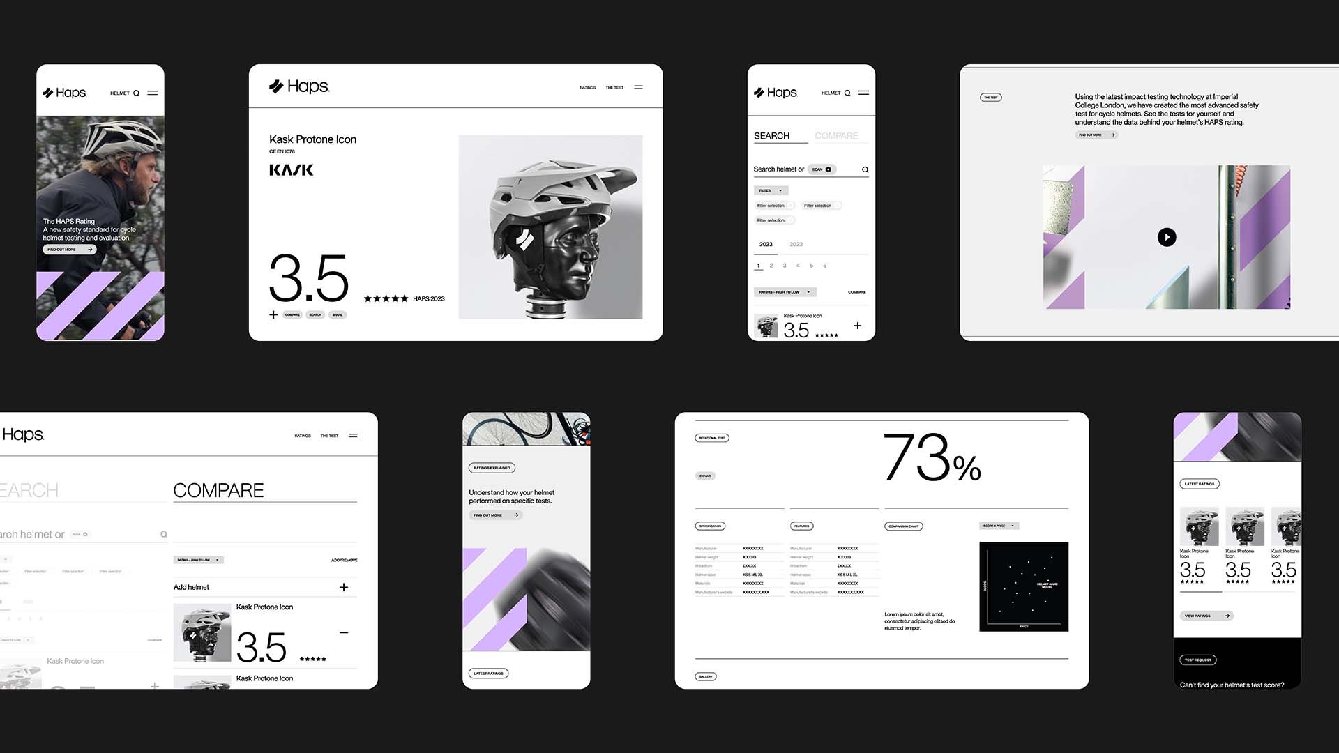
Haps website homepage – JMCO
Typography that balances trust and modernity
-
The typography combines a clean and contemporary typeface with subtle nods to classic design principles, creating a balance of trustworthiness and modernity. This fusion symbolises the organisation’s dual commitment to rigorous safety standards and cutting-edge innovation. The typeface ensures clarity and readability across all platforms, reinforcing the brand’s accessible and authoritative tone of voice.
Haps adshel – JMCO

The cycle helmet rating scheme’s branding achieves a balance of authority, trust, and modernity. The integration of the 45° impact logo, clinical purple colour palette, and contemporary typography creates a powerful identity that is both visually striking and deeply meaningful.
This cohesive brand positions the scheme as a credible and respected authority, giving consumers the confidence to make informed choices while challenging manufacturers to innovate and raise safety standards. By unifying safety information under a trusted and recognisable identity, the scheme has the potential to make a significant and lasting impact on consumer behaviour and industry practices, ultimately contributing to a safer future for cyclists everywhere.
CREDITS
Strategy and copywriting: with David Sharp
Font: APK Protocol by Autograph
